Lox Club
Creating a Napkin Notes feature to foster meaningful dating app connections.
Project Overview
Client
Lox Club is a members-only IOS dating app for Jewish people.
Challenge
Starting conversations on a dating app is hard. Luckily the fun images and creative prompts on Lox Club profiles contain plenty of conversation starters. We wanted to allow our users to easily leave “notes” for each other when liking a potential match.
Solution
Napkin Notes will generate more matches (people will want to match more with someone who left them a note), more responses, more conversations, and will ultimately retain users on the Lox Club.
Tools
Figma
Photoshop
Timeline
January 2022 - March 2022
Role
Lead Product Designer (Research, Visual Design, Interaction Design)
Team
Partners: CEO, Product Manager, Engineers
Napkin Notes Feature
The result of this project was a feature that was designed to increase the response rate for conversations between two matches on the Lox Club. We oriented this feature around a note written on a napkin because the Lox Club app is designed to feel like a speakeasy hidden within an old-school Jewish deli.
Sending A Napkin Note
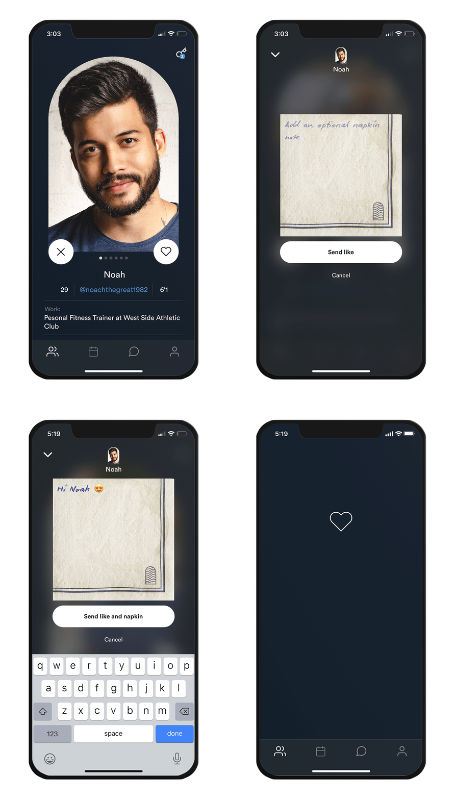
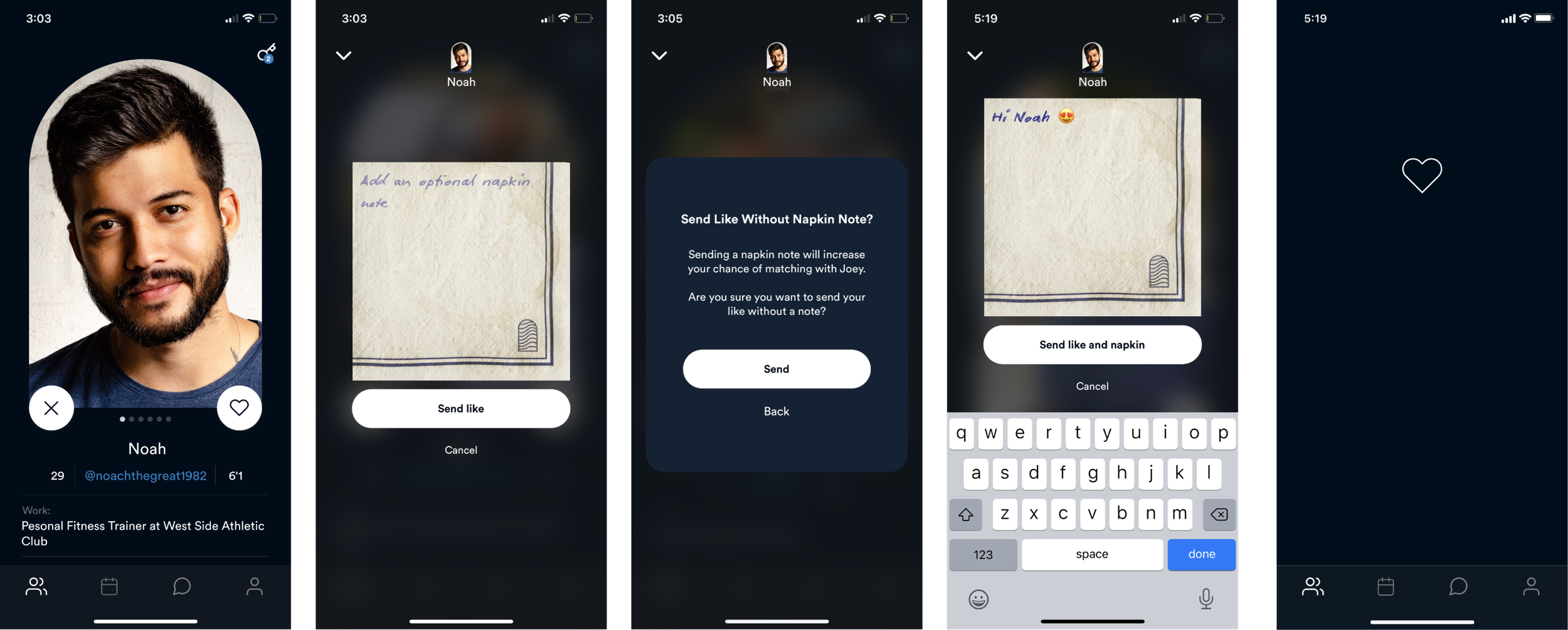
The first part of this feature allows users to send an opening line to potential dating matches when they like their profiles and are interested in getting to know them more.
Receiving A Napkin Note
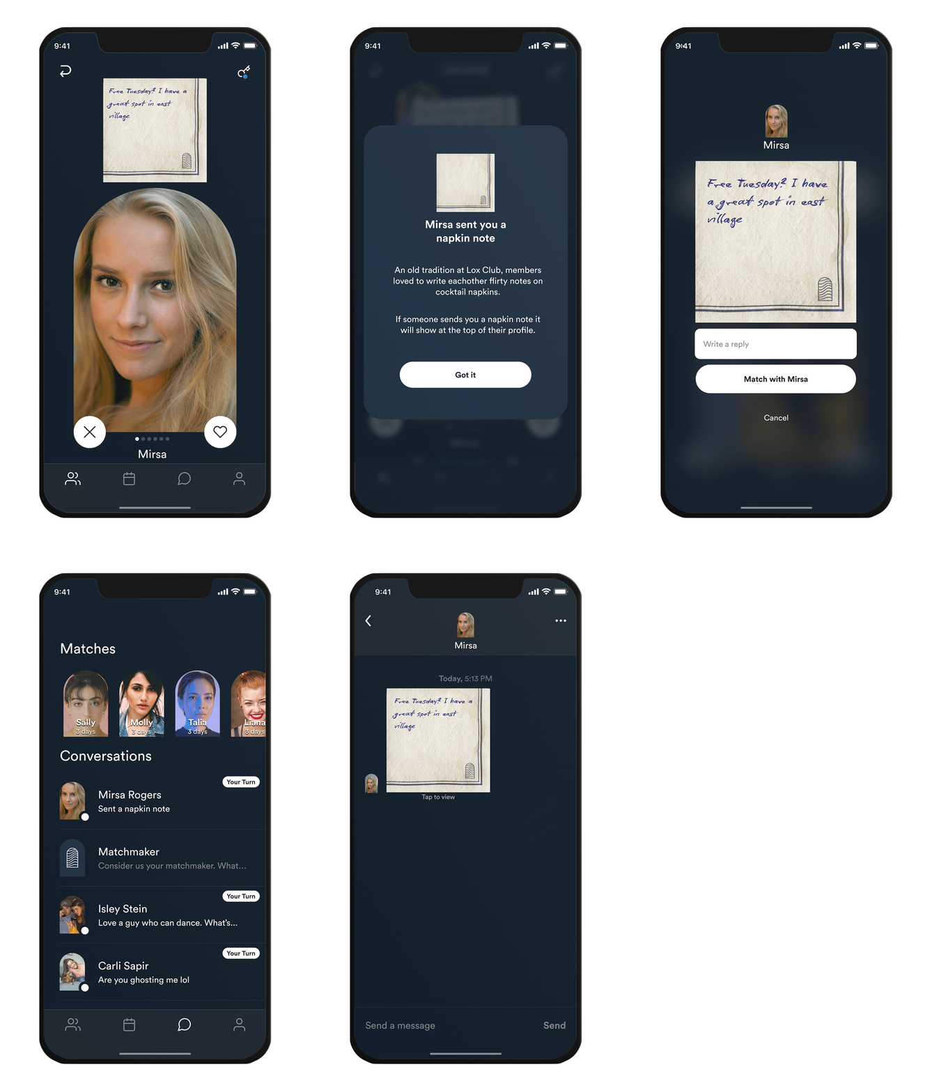
Users can then see the napkin notes that potential matches have sent them when their dating profile appears in their queue and then choose whether they want to match with them and reply.
Design Process
Exercises and deliverables for creative problem solving.
Empathize & Define
Market Research
User Stories
Ideate
User Flows
Wireframes
Prototype & Test
High-Fidelity Prototype
Priority Revisions
Market Research
Lox Club’s Napkin Notes feature was modeled after the popular dating app Hinge. We used Hinge as inspiration because of the seamless user experience created by the app’s profile commenting feature and the app’s popularity.
Hinge generated $197 million revenue in 2021, a 118% year-on-year increase
20 million people use Hinge, 800,000 pay for its premium services
In the US, Hinge has 15% market share in the dating app market
Hinge’s profile content commenting and liking has also been successful in increasing response rates by 3%.
Hinge used data to reveal how “the endemic superficiality of [swiping] dating apps” was leading to less connection on their app. Their data revealed that:
Only one in 500 Hinge swipes led to a phone number exchange
81 percent of Hinge users reported that they had never found a long-term relationship through a swiping app
So, Hinge introduced profile content commenting and liking to roll back on that superficiality and removed swiping so users would reveal what they liked about a person beyond their picture. Here’s how it works:
User Stories
Then, my Product Manager assembled user stories to guide the development of a feature that allows users to comment on a user’s profile. These were assembled based on Hinge’s feature and survey results where that 52% of Lox Club Members were frustrated that most of their matches never turned into a conversation.
User Stories:
As a match-seeker I want to comment on specific parts of a candidate’s profile to make myself stand out from other people
As a match seeker, I want to see which profiles have left me napkin notes (😏 it might also make me want to match with them more)
As a user I want to more easily engage in conversations with my matches by talking about something I’m already familiar with (the info on a profile), so more of my matches can convert to dates
User Flows
Next, I went into more detail and determined several different paths that users could when leaving Napkin Notes and receiving them. This also served as a reference for the screens I would design later.
Select image to expand.
High Fidelity Wireframe & Prototype
I then referenced the user flows and user stories to put together high-fidelity wireframes and a prototype to review with the CEO, Product Manager and Engineers for feedback.
Select image to expand.
What Was Shipped
Ultimately the feedback from the CEO and engineering was that the feature was too complex from functionality and technical perspective to roll out all at once by the desired deadline. So, we shipped a scaled-down version of the feature that allowed users to send one napkin note in response to an entire profile vs a napkin note as a response to individual prompts and photos.
Sending A Napkin Note
Receiving A Napkin Note
Reflection
This project was successful in that it shipped and Lox Club users are currently using it to form more meaningful connections on the dating app. One challenge of this project was the tradeoff between brand and usability. The UI of writing on a napkin with an on-brand, handwritten font was on brand but it wasn’t the easiest to read. However, a huge part of why users are attracted to Lox Club is their “speakeasy inside a Jewish deli” branding and it was important to the CEO to convey this through the design and to utilize the napkin. I was able to compensate for some loss in legibility by allowing the napkin to be expanded where it was minimized in the conversation thread so users could have a closer look at the text.
Another key takeaway from this project was the iterative nature of the design. We were able to release a simpler version of the Napkin Notes feature to test with users before investing time and resources in a more complex version of the feature. We can also leverage the learnings from the current iteration to create a better design when we do implement the full feature.
Next Steps
I was contracted to work with Lox Club as the solo Product Designer for this feature and others for Q1 2022 so I am unsure how this feature will evolve moving forward. However, when my contract ended, the plan was to implement the rest of the original design I put together which would allow users to comment on individual profile prompts and photos!


